Markos Font: A Web Designer’s Layout Review
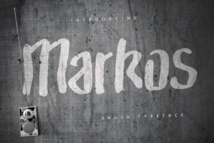
I was recently redesigning a landing page for a creative coaching client who wanted her site to feel less corporate and more authentically human. We had the perfect photography and a solid color palette, but the typography felt sterile. Every clean sans serif font I tested made the brand look like a tech startup rather than a warm, personal mentorship program. That is when I decided to test Markos in the hero section. The difference was immediate. This strong rough brush typeface brought an organic texture to the screen that perfectly balanced the polished UI elements surrounding it.
As web designers, we often hesitate to use display fonts with heavy texture because we worry about rendering issues or readability on smaller screens. However, after testing Markos across multiple breakpoints and project types, I have found it to be a surprisingly versatile tool for digital branding. It is not just a decorative novelty; it is a functional design asset that can define the emotional tone of a website when used with intention. Whether you are building a portfolio, an e-commerce storefront, or a course sales page, understanding how this typeface behaves in a responsive environment is key to making it work effectively.
Evaluating Visual Hierarchy in Hero Sections
The primary strength of Markos lies in its ability to command attention without feeling aggressive. In web design, the hero section has roughly three seconds to communicate value and vibe. When I applied Markos Medium to a main headline, it created an instant focal point. The rough edges of the brush strokes add a layer of tactile depth that flat digital fonts simply cannot achieve. This texture helps break up the "digital gloss" that often makes modern websites feel impersonal.
However, hierarchy is everything. Because Markos is a display font with significant character, it demands negative space. During my testing on a boutique online store homepage, I found that crowding the text against navigation bars or busy background images caused visual vibration. The font performs best when it is allowed to breathe. I recommend using generous line-height settings and ample padding around the text container. This ensures the rough brush details remain distinct and do not blur into adjacent elements, which is crucial for maintaining a premium font aesthetic on high-resolution displays.
For subheadings or supporting hero text, switching to Markos Light or Markos Extra Light provides excellent contrast. The lighter weights retain the hand-painted charm but with reduced visual mass, allowing them to sit comfortably beneath the heavier title. This variation within the same typeface family creates a cohesive brand identity while establishing a clear reading order for users scanning the page.
Responsive Behavior and Mobile Readability
A font that looks stunning on a 27-inch monitor can quickly become illegible on a smartphone. This is the most critical test for any creative font intended for web use. I tested Markos extensively on mobile viewports to see how the rough textures held up at smaller sizes. The results were generally positive, but they require specific CSS considerations.
On desktop, the intricate brush details are crisp and expressive. On mobile, however, those same details can risk looking muddy if the font size drops too low. For responsive layouts, I found that Markos works best for short, impactful phrases rather than long sentences. A three-to-five-word headline in Markos Medium scales down beautifully, retaining its personality even at 32px or 40px base sizes. Conversely, trying to force a ten-word tagline into this typeface on a narrow screen compromised readability.
- Minimum Size Threshold: Avoid using Markos below 24px on mobile devices to preserve stroke clarity.
- Contrast Ratios: The textured edges can reduce perceived contrast. Always test your color combinations against WCAG standards, especially when placing white text over dark backgrounds.
- Touch Targets: Never use this font for interactive buttons or links. The irregular baseline and varying letter widths make it difficult for users to identify clickable areas accurately.
- Loading Performance: Brush fonts often have larger file sizes due to complex vector paths. Use modern webfont formats like WOFF2 and consider subsetting to improve load times.
When designing for touch interfaces, remember that usability trumps aesthetics. Markos is a fantastic tool for setting the mood, but it should never obstruct the user journey. If a heading becomes hard to read on a phone, switch to a clean sans serif for that specific breakpoint and reserve Markos for larger tablet and desktop views.
Strategic Font Pairing for Digital Interfaces
Markos has a very distinct personality, which means it needs a supportive partner to function well in a full website layout. The goal of font pairing in web design is to create balance. Since Markos brings the noise, texture, and emotion, your secondary typeface should bring structure, clarity, and neutrality.
In my recent projects, I have found that geometric sans serif fonts are the ideal companion. A typeface with uniform stroke widths and open counters provides a stable foundation that lets Markos shine without competing for attention. For body copy, blog posts, and product descriptions, stick to highly legible system fonts or premium web fonts designed specifically for screen reading. The contrast between the organic, hand-crafted feel of Markos and the precise, engineered look of a modern sans serif creates a sophisticated editorial design aesthetic that feels both current and timeless.
You might also consider pairing Markos with a simple serif font for a more traditional or academic vibe, particularly for coaching sites or educational platforms. The serif adds a touch of authority that grounds the playfulness of the brush script. Whatever you choose, avoid pairing Markos with other handwritten or decorative fonts. Too much personality in one viewport leads to visual chaos and cognitive overload for the user. Let Markos be the singular voice of expression in your typographic system.
Best Use Cases and Practical Limitations
Through various client projects, I have identified specific scenarios where Markos elevates the user experience and others where it detracts from it. Understanding these boundaries is essential for professional web design.
Where Markos Excels
- Landing Page Headlines: Perfect for communicating brand values or campaign slogans above the fold.
- Portfolio Overlays: Adds artistic flair when placed over project thumbnails or case study headers.
- Social Media Graphics: Translates exceptionally well to Instagram stories and Pinterest pins embedded on blogs.
- Digital Brand Kits: Serves as a distinctive logo lockup or accent element in style guides.
- Section Dividers: Using Markos Extra Light for short transition phrases helps break up long-form content visually.
Where to Exercise Caution
Despite its charm, Markos is not a universal solution. I strongly advise against using it for navigation menus, footer links, form labels, or dense data tables. These interface elements rely on rapid recognition and uniform spacing, both of which are intentionally disrupted by rough brush typography. Accessibility is also a major consideration; users with dyslexia or visual impairments may struggle with textured letterforms. Always provide a fallback option or ensure that decorative headings are properly tagged in the HTML so screen readers can interpret the semantic meaning regardless of the visual presentation.
Additionally, be mindful of licensing before deploying this font on a live site. Commercial font licensing for web use often differs from desktop licensing. Verify that your license covers the expected monthly pageviews and includes permission for embedding in digital templates or client deliverables. Checking file formats, multilingual support, and available alternates upfront will save you from mid-project headaches and ensure your final design is both legally compliant and technically robust.
Ultimately, Markos is a powerful addition to a web designer's toolkit when treated as a specialized instrument rather than a default setting. It brings warmth, humanity, and creative energy to digital spaces that desperately need it. By respecting its limitations regarding readability and pairing it thoughtfully with structural typefaces, you can create online experiences that feel as crafted and intentional as the brands they represent.